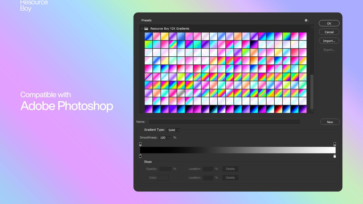
About 200 Y2K Photoshop Gradients
Design work moves fast. When you find a solid graphic design resource, it can shave hours off a deadline. It’s made for Adobe Photoshop, and the previews show what you can expect.
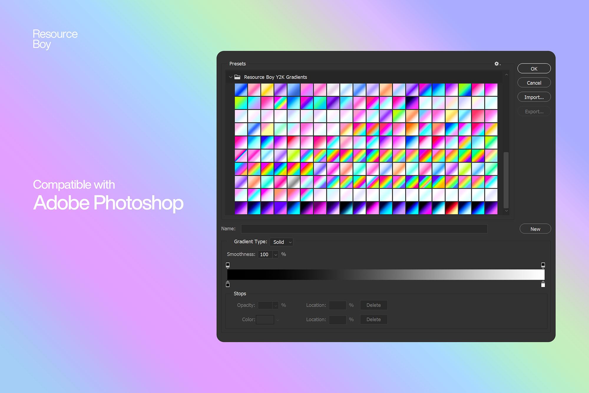
This free set of 200 Y2K Photoshop Gradients isn’t built on trend-chasing or random color choices. Before creating anything, we analyzed hundreds of authentic Y2K-era visuals, album covers, posters, early web interfaces, and digital graphics from the late ’90s and early 2000s. We extracted recurring color patterns, contrast behavior, and the distinct digital glow of the era, then translated them into gradients. The result is a collection that feels genuinely Y2K, balanced, intentional, and production-ready, not just neon for the sake of nostalgia. If you’re already familiar with our broader Photoshop Gradients collection, this pack is a focused extension of that system. For best results, these gradients are designed to work alongside the right typography. Y2K visuals are as much about type as they are about color. To help you build a cohesive look without wasted experimentation, we’ve paired this release with a curated selection of Y2K Fonts. Used together, they recreate the full aesthetic language of the era, from color mood to typographic attitude.
Quick details: License: Personal & Commercial use. Designer: Resource Boy. Popularity: 1,486 downloads.
What you can do with it
It plays nicely with real-world files, not just perfect demo PSDs. Use it for landing page hero sections, YouTube thumbnails, packaging concepts, or any layout where you want a cleaner visual hook.
How to use it in Adobe Photoshop
Download, unzip, load the asset, then tweak until it fits your design.
- Download the ZIP file using the button below.
- Unzip the archive to a clean folder.
- Open Adobe Photoshop and load the included files (brushes via the Brushes panel; textures via Place/Embed; mockups/effects by editing Smart Objects).
- Apply it to your text or layer, then adjust size and position.
- Fine-tune opacity, blending mode, and color until the result feels balanced.
Practical tips
- Use Smart Objects when possible for clean scaling.
- Duplicate your layer before applying anything.
- Test it on both light and dark backgrounds.
- Try a different blending mode before you give up on the look.
- Lower opacity first, then adjust contrast.
If something looks “too much,” small changes usually fix it. Opacity, blending mode, and a soft mask solve most issues.
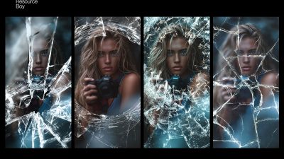
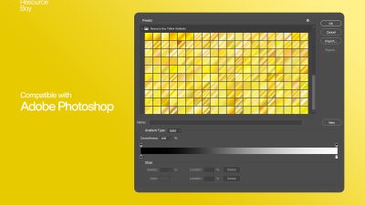
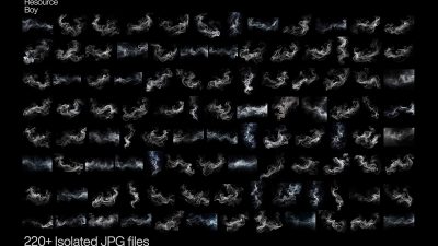
Preview images
These previews are included with the original post so you can judge edges, texture strength, and readability.
FAQ
Can I use it in client work?
The listed license is Personal & Commercial use. For important jobs, read the license text inside the download.
Will it work on older versions?
Most assets like this work fine on recent versions of Adobe Photoshop. If you’re on an older build, test it in a duplicate file first.
Download 200 Y2K Photoshop Gradients
Use the download button below. If your download is large, give it a minute to complete before extracting.